In making a picture on paper, or looking at a picture, only the first five of these cues, together with perspective convergence are available to us. The depth information we get from binocular disparity, accommodation, convergence and motion cannot be used in 2D pictures.
I have chosen to try to illustrate some of the concepts discussed here,
by using my own drawings. This is not because the drawings are good, but
because I know there are no copyright issues!
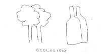
Occlusion
This is a very strong cue for depth, and it’s equally
effective in personal space right through to vista. It will generally override
information about relative size, for example. Occlusion was used even in the 20,000
year old cave paintings of Chauvet, for example.
In a city, things in personal space will often occlude a
large part of the visual field, but sometimes only fleetingly. Think of a
person walking past, close to where you are drawing – for a fraction of a
second a part of your visual field might be occupied only by a head and
shoulders, say, occluding what is further away. Our first response is often to
ignore this kind of interruption, and to make no marks about it in our drawing.
But maybe some drawn reference to this fleeting occlusion would increase the
sense of movement and depth in your drawing?
 |
| A busy day at the National Gallery |
 |
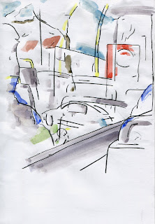
| Drawing on the bus |
Sometimes it’s interesting to choose a drawing view in which
there is deliberate occlusion by objects near you – the café table drawing is
an example, or drawing in the theatre or on a bus. Even if you choose to draw where there is nothing in personal space,
things will sometimes intrude and it’s interesting to include them somehow in
your drawing.
Unless you're sitting at a table or very close to other people, or street furniture, etc, there's often nothing obvious in our personal space. Unless you look down! The ground at our feet is in our personal space. Perhaps there are ways of incorporating this in our drawings. (If you do this you may find yourself needing to add paper to your drawing to include both the ground and the view at eye level. This is what I did in the drawing of St Paul's in an earlier posting)
Relative size
This too is a cue which extends over all 3 spaces, although
it is not as strong a cue as occlusion – partly because there may be some
uncertainty about the actual size of objects. The relative size of things is much more powerful a cue when they are close to you.
 |
| Skaters at Somerset House |
You can exploit relative size to give dramatic effect to
your drawing. You will notice this if you draw a street (action space) with
figures, and include a figure that comes close to, or within your personal
space. It’s almost impossible to draw the close figure large enough. When
figures are very close to us, we can’t see the whole figure without changing
our viewpoint.
This effect increases dramatically as things enter personal space. Including
just a section of a large figure in a
drawing implies closeness. Just a hand
of someone walking past at a distance of half a metre may appear as big as a
whole crowd 20 meters away.
 |
| Asakusa |
Again, it’s sometimes a good idea to add paper to increase the size
of your drawing if you find that things close by in personal space, are taking
up more of your drawing than you expected.
Relative density
This cue works well over short to medium distances.
Representing paving stones, or cobbles in a street for example.
 |
| Relative density of the gridded fence increases with distance |
Does it work in
personal space? Yes, but less strongly, I think – think of a chequered
tablecloth in front of you for example.
Over long distances the difference in
density may be too small to perceive. For this reason, it’s often impossible to
draw patterns on things in vista space to indicate
relative density. Changes in density on objects in personal space, for example in a table top texture, are often too slight to be useful in a drawing.
Height in the visual field
This cue works well over action space and vista, and has
been used in traditional art in many Asian cultures to depict space (See, for
example Chines scroll paintings).
 |
| window view, Venice |
Some art cultures have effectively tipped the
ground plane up until it is vertical, parallel with the picture plane, and used
relative height as the main indicator of distance. (Much Mughal art from India
used this device). Are there creative ways you can incorporate some of this
approach in your own work?
In personal space, where things are so close to you, height
in the visual field can be very confused, and a poor indicator of spatial distance.
Aerial perspective
Strictly speaking this only works in drawings that include vista, and
it works most effectively using colour. Distant views become bluer, less distinct
and lower contrast as they recede.
 |
| from the train to Matsumoto |
It is possible to depict this without colour as long as the
medium being used allows for tone – things getting lighter and less distinct as
distance gets bigger.
 |
| Aerial perspective in tone, Bankside, London |
It’s also possible to use the aerial perspective depth cue
in views where it can’t actually be seen. You could for example, choose to draw
everything that’s close to you in a darker tone than things further away, even
though they are all within 30 metres or so. As if aerial perspective was visible over such a short distance.
 |
| In a restaurant kitchen |
You could similarly choose to use a range of different colours to draw a number
of different bands of depth.
 |
| In a restaurant kitchen |
So, that's the end of the briefing notes, for now, at least. In a few hours I'm off to Barcelona to enjoy meeting and drawing with urban sketchers from all over the world. I'm sure I'll learn a lot, and have a lot of fun!
Finally, I'd like to repeat that I'm not suggesting that the ideas in this blog are 'the right way' to draw. They may not even be 'a good way' to draw for you. The purpose of the blog is simply to add some more thoughts and ideas to the exploration I hope will happen in the workshops in Barcelona. Now, let's draw!


